Simply Connect
Recent studies explore the power of technology to shape reality and create new unforeseen possibilities. Simply Connect is a platform to address the issue of social isolation and loneliness found in the majority of older adults as a simple and intuitive interface to tailor to the specific needs of older adults. We aim to bridge the intergenerational communication gap by making digital connections feel natural and empowering. Simply Connect focuses on clarity, accessibility, and emotional relevance to reimagine how older adults can build and maintain meaningful relationships in our increasingly digital world.
Human Computer Interaction
As people age, maintaining meaningful social relationships becomes both more challenging and more important. Older adults are disproportionately affected by social isolation and loneliness—conditions linked to increased risk of depression, cognitive decline, and premature mortality. Yet most mainstream platforms often rely on small touch targets, frequent UI changes, and nested menus that overlook older adults’ needs. This disconnect is not rooted in older adults’ lack of interest or capacity but in design choices that overlook their needs and preferences.
By grounding every decision in direct feedback, Simply Connect aims to deliver an inclusive digital experience that empowers older adults to engage with ease and confidence, inspiring future studies on inclusive and accessible design.
Context
Challenge: Many older adults want to stay in touch with loved ones, but find digital platforms confusing or inaccessible
Opportunity: Create an accessible, low-effort digital experience that fosters emotional connection without requiring advanced tech fluency
Research Questions
How can digital platforms be designed to better support emotional connection for older adults?
What design features are most effective in creating an intuitive and easy-to-use platform that helps bridge the digital divide?
Contextual Inquiries
We interviewed adults aged 60+ to better understand their experiences with existing social platforms. Key pain points emerged:
Complex, cluttered interfaces with small touch targets
Overwhelmed and anxious while navigating apps
Reluctance to interact due to privacy and security concerns
Reliance on younger family members for assistance in tech
Limited motivation to post content, but strong desire to connect with family through viewing updates
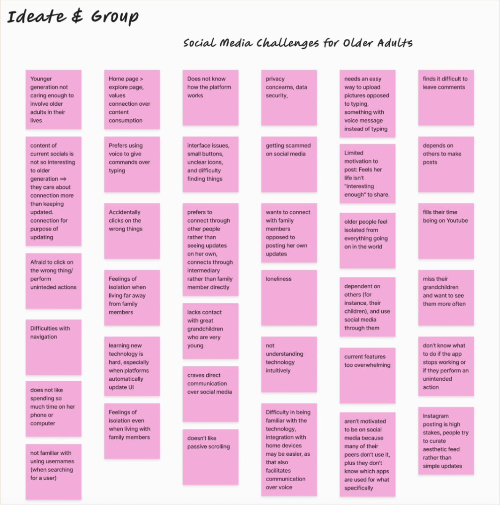
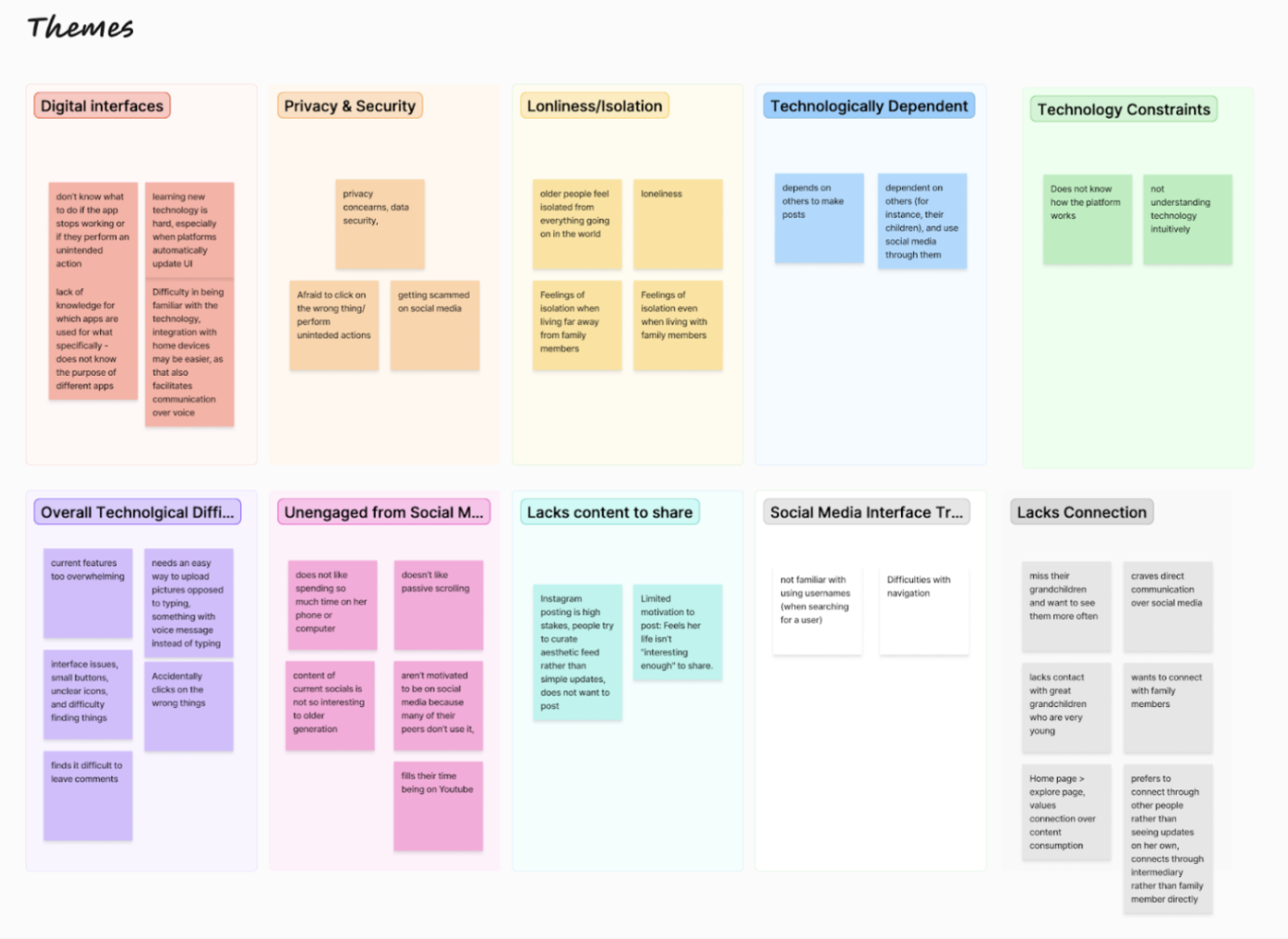
Affinity Diagramming
We organized our data from contextual inquiries and secondary research into an affinity diagram. By grouping similar comments and observations, we were able to spot the following recurring themes
Digital Interfaces and Overwhelm: cluttered layouts, small touch targets, and frequent UI changes eroded confidence and hindered basic navigation.
Privacy and Security Concerns: fear of scams or accidental posts discouraged personal sharing.
Loneliness and Isolation: mainstream platforms offer surface contact but rarely enable the meaningful conversations participants sought with grandchildren.
Dependency on Others: posting, photo uploading, and troubleshooting still require younger relatives, limiting autonomy.
Limited Motivation to Share Content: daily life was deemed “not interesting,” and composing updates felt tedious, leading participants to remain passive consumers
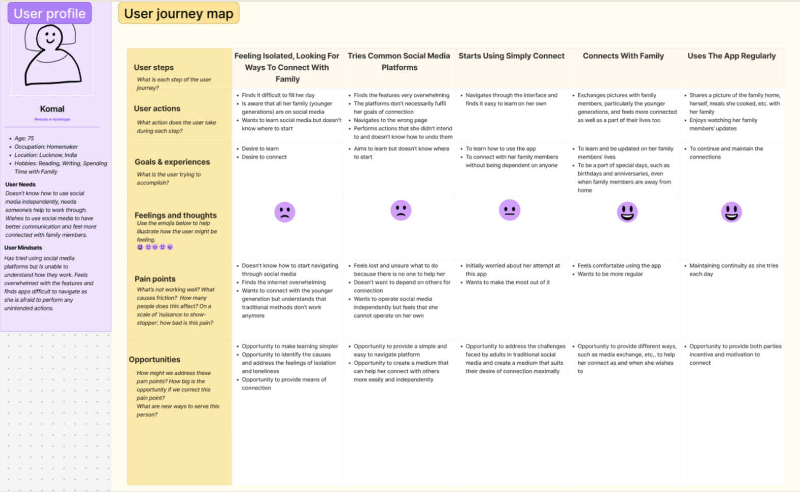
Journey Mapping
Next, we constructed 3 different journey maps to outline a step-by-step account of how older adults interact with social media. This approach helped us capture not only the sequence of actions (e.g., signing up, posting updates) but also the emotional responses and technical stumbling blocks at each stage. Journey mapping revealed moments where connection could happen but didn’t, often because older adults didn’t know how to engage.
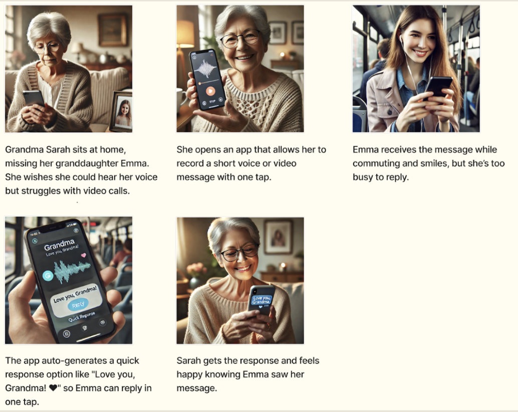
Storyboarding
To address the core challenges identified in our user research, we developed a series of storyboards exploring how Simply Connect could support older adults in key social contexts. These scenarios focused on three central themes: emotional connection, trust, and inclusion.
This scenario explores how asynchronous, low-effort video and voice messaging could support emotional closeness between grandparents and grandchildren. By enabling simple, one-tap communication and auto-generated replies, this design lowers the barrier of communication while maintaining a sense of presence.
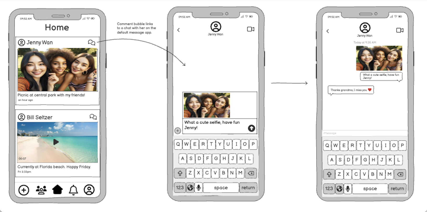
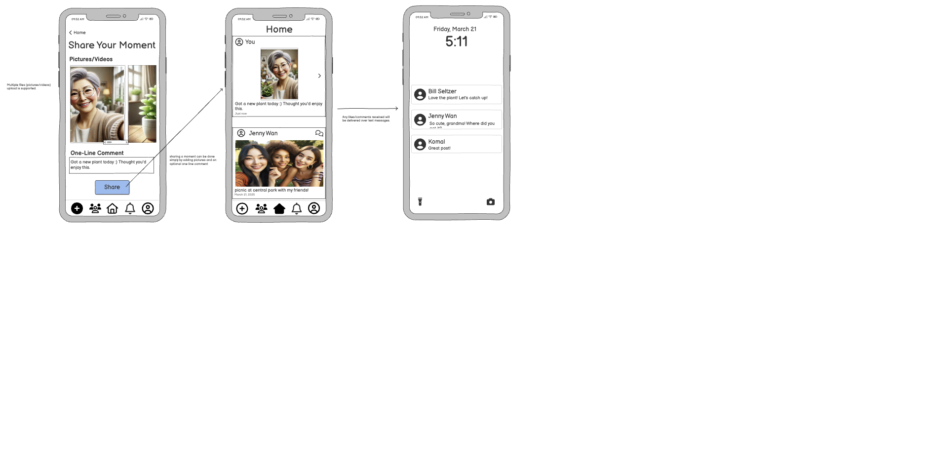
From this storyboard, we were inspired by the low barrier of communication that this design hill accomplished. While we did not incorporate this video and voice messaging feature into our platform, this storyboard led to our key design feature of moving all communication and connection to the users default messaging app - more on this later :)
Ideation
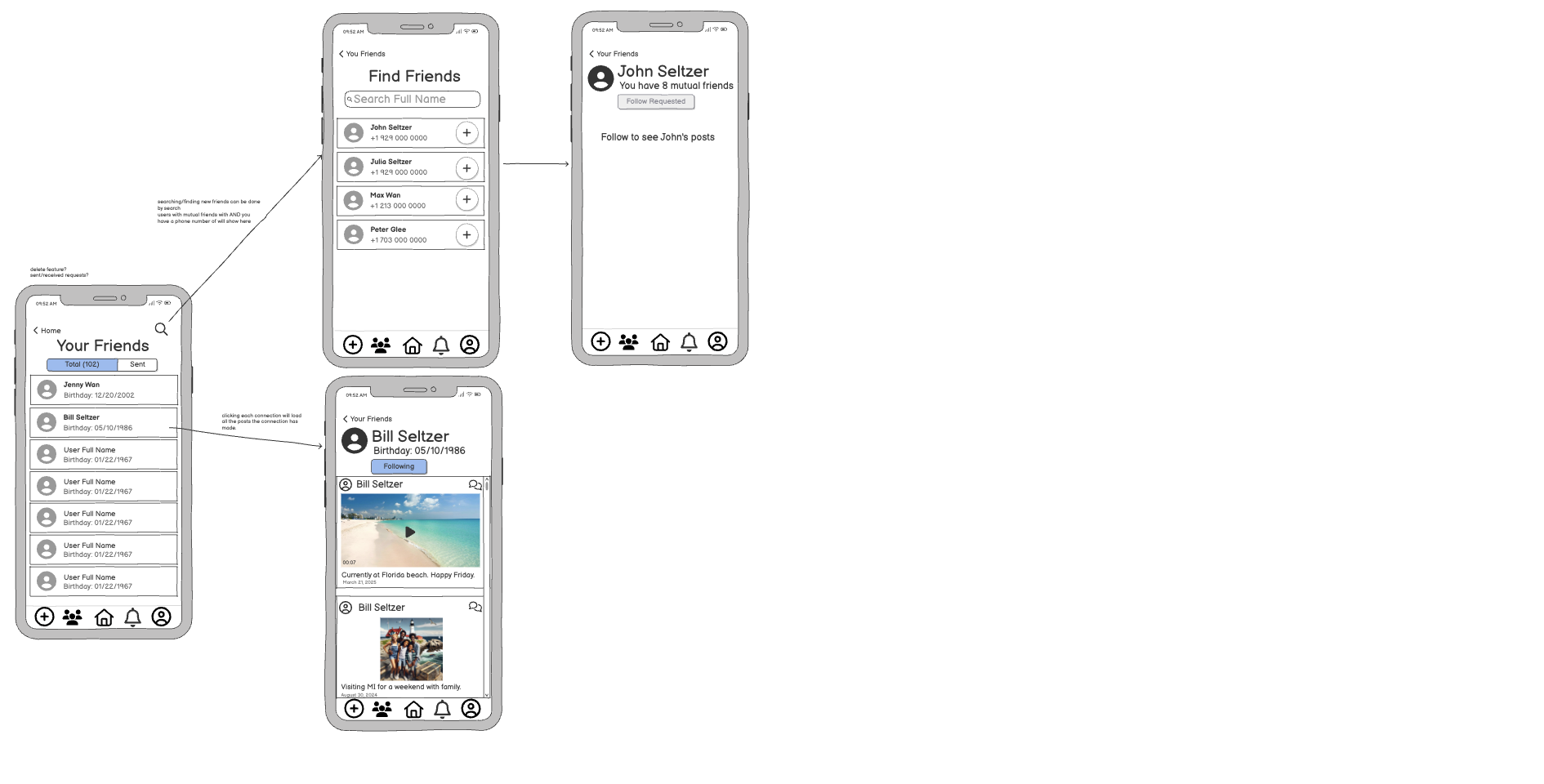
I created low-fidelity wireframes in Balsamiq to explore layout and navigation emphasizing large, readable text and making the decision to avoid building an internal messaging feature. Our most important design decision, rooted in simplicity and intuitive use, was to route all communication through users’ default messaging platforms.


Final Prototype
Figma coming soon :)
Evaluation: Wizard of Oz Study
We conducted a 1-week test with 8 older adults who received simulated daily photo updates from family members. This was meant to mimic the posting nature of Simply Connect, but with the technicalities out of the way. Participants spent the week sending “posts” or updates to their older family member or friend 3 times a day and we came to our conclusions through interviewing both the younger and older participants after the study.
Older participants reported feeling "included again" and "comforted" by the updates.
Even without active replies to every photo, the older adults valued simply receiving consistent updates.
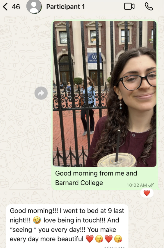
In the interview, participant 1 shared that it felt like she had a magnifying glass into her granddaughters life and that she hoped she would continue to receive updates even after the study concluded.
One participant flagged that family dynamics (unsolicited critiques) can sometimes create discomfort — highlighting the need for thoughtful content boundaries.
Evaluation: Usability Testing
We tested participants’ ability to intuitively complete key tasks (view post, react, open friends list, send reply).
We received positive feedback on the prototype’s clarity, simplicity, and overall ease-of-use.
Improvements identified:
Older adults would benefit from an onboarding tutorial as support when the platform is first downloaded and easily accessible at all times
Improvements on icon clarity
Inclusion of adjustable text sizing
Conclusion and Future Work
Key takeaways:
Simplicity empowers confidence.
Emotional connection does not require complex interaction.
Familiar tools (existing messaging apps) help reduce learning barriers.
Flexibility is critical — not all users want the same frequency or type of interaction.
Accessibility must be baked into every stage of design.
Future work will focus on:
Onboarding and tutorial flows
Content personalization options
Voice interaction support
Broader user testing across diverse older adult populations
Building a functional MVP to test long-term engagement
Reflection:
This project taught me that accessible design is not just about interface—it’s about dignity, confidence, and emotional connection. Designing for older adults requires us to rethink assumptions and deeply understand user contexts. Simply Connect allowed me to explore how intentional simplicity can create more meaningful and empowering digital experiences.